From Relationships to Charts: Why Communication is Key?
Charts can be simple and complicated at the same time. Just like relationships. At the surface, you feel that you understand what they are trying to tell you, yet, you know that you have to focus more to understand what they are saying. Charts that is. Relationships are on another communication level.
To illustrate the notion above, I took a chart from Google images and interpreted it. The Google images charts looks like this:
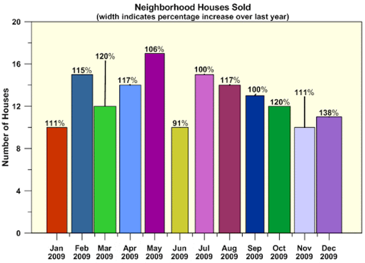
Google Image Chart
What do you see? What is the main point this chart is telling you? How many stories is this chart telling you? What are the numbers telling you?
Generally, if a chart is telling you more than one story, then it may not be a good chart. The chart should present its information in the most straightforward and pain-free way. As a viewer, you should not be playing guessing games with any chart. It’s like being in the right relationship, when you know, you know.
Let us look at my first interpretation of the Google image below:

My first interpretation of Google image chart
It looks different, right? The first thing to do with any chart is to identify what it is trying to tell you. The Google image chart was telling me that something was happening over a period of time. Time is best depicted in a line chart, so I used a line chart.
Then, I moved on to clear the “noise”. Noise includes meaningless colors, backgrounds and an X or a Y axis that shows redundant information. I replaced the Y-axis here with a text box, as you can see from “Number of houses sold”. Then I highlighted only the data I wanted to show with the color orange, including the Y-axis label. I felt that the decrease from August to November was important and so I colored it. A pop of color is good to use in charts, but only to show what you want the audience to see; not to celebrate every finding on the chart. I added a dotted break line to show where the decrease started and explained all of that in the title.
What do you think of the title? Titles are usually misunderstood. They are a strategic tool rather than a decorative piece. They should spell out what the chart is saying and not describe it. Replacing a descriptive title like “Neighborhood houses sold” with a stronger and analytic title, is always good move. Naturally, I asked for an evaluation.
Looking at the chart once more you may ask, but what is that drastic drop in June. Don’t worry, I saw it too. My second interpretation of the Google image chart would look like this:

My second interpretation of Google image chart
As we did with the earlier chart, highlight the information you want to showcase, add a dotted line to mark the drop and label the information you want the audience to understand. If you notice, I added the label before the drop too because I thought it is important to show how big the drop is. Then make sure the title sums everything up for your audience. Later in life, when you look back at this chart, the title will tell you everything you need to know instead of keeping you guessing; your boss, client and mother will thank you.
Finally, let’s say an evaluation did take place and that the results were in. Let’s also say, hypothetically, that the drop in sales was due to a high employee turnover. My interpretation of the hypothetical evaluation results would look like this.

My third interpretation of Google image chart
I highlighted what needs to be highlighted for both the original and evaluation findings, simultaneously. Colored the evaluation result in blue and paired it with its blue “Y-Axis” label, similar to the orange finding and label mentioned above. Then, I summarized the whole chart in the title. Simple? All of this was done through Excel, then Powerpoint and the heavy use of text boxes (my new best friends).
As a final note, it is important to remember to keep your charts as simple as possible yet packed with the information you want your audience to leave with. Playing with colors, labels and titles is only the start and data visualization, as simple as it looks, is a complex field with various elements. Elements that need to be taken into consideration (like what to show in a chart) and edited down (like what not to show in a chart). Similar to relationships. Communication is key.
Let me know what you think of these interpretations by dropping me a line in the comments. Pick a random chart from the web and recreate it. Would love to see your data visualizations.